React is one of the most popular javascript frameworks and it has over 180k stars on Github. According to the stackoverflow's developer's survey that was carried out in 2021, it was shown that React is still the most desired Javascript framework.
UI libraries help to build easy, consistent, and appealing user interfaces. UI libraries serve as building blocks for layouts. They consist of UI components such as Dialogs, Buttons, Alerts, Modals, etc.
Although there are lots of React UI libraries, I will be highlighting the most popular and useful Libraries to use in your next react project. I will also be walking you through the process of using them in your projects.
MUI
Ant design
Chakra UI
React Bootstrap
Grommet
PrimeReact
Shards React
React Suite
1. MUI
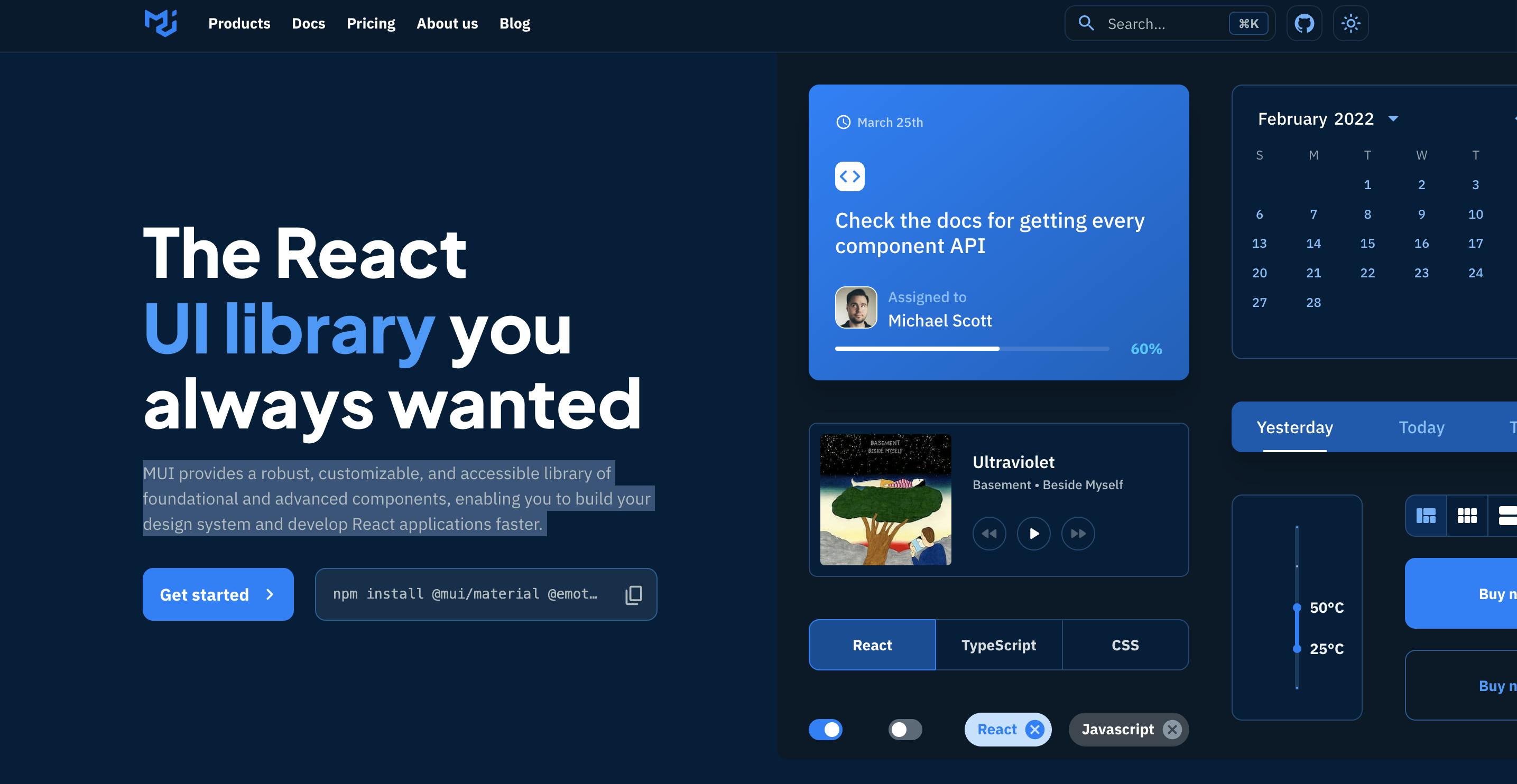
MUI formerly known as Material UI provides a robust, customizable, and accessible library of foundational and advanced components, enabling you to build your design system and develop React applications faster. It is the world's most popular React framework.
Material UI library includes components such as buttons, forms, date pickers, cards, etc to help build your application faster. The documentation is also one of the most concise documentation that I've come across. You can check it out here.
Installation:
To install MUI, run the command below.
//with npm
npm install @mui/material @emotion/react @emotion/styled

//with yarn
yarn add @mui/material @emotion/react @emotion/styled
Usage
After installing MUI, you'll have to import the component you need into your project.
import TextField from '@mui/material/TextField';
import Button from '@mui/material/Button';

export default const App = () => {
  return (
    <div>
      <TextField variant="outlined" label="enter your email..." />
      <Button color="secondary" variant="contained">
        Subscribe
      </Button>
    </div>
  );
};
MUI also has free and premium templates that you can use to kickstart your project. You can find the templates here
2. Ant Design
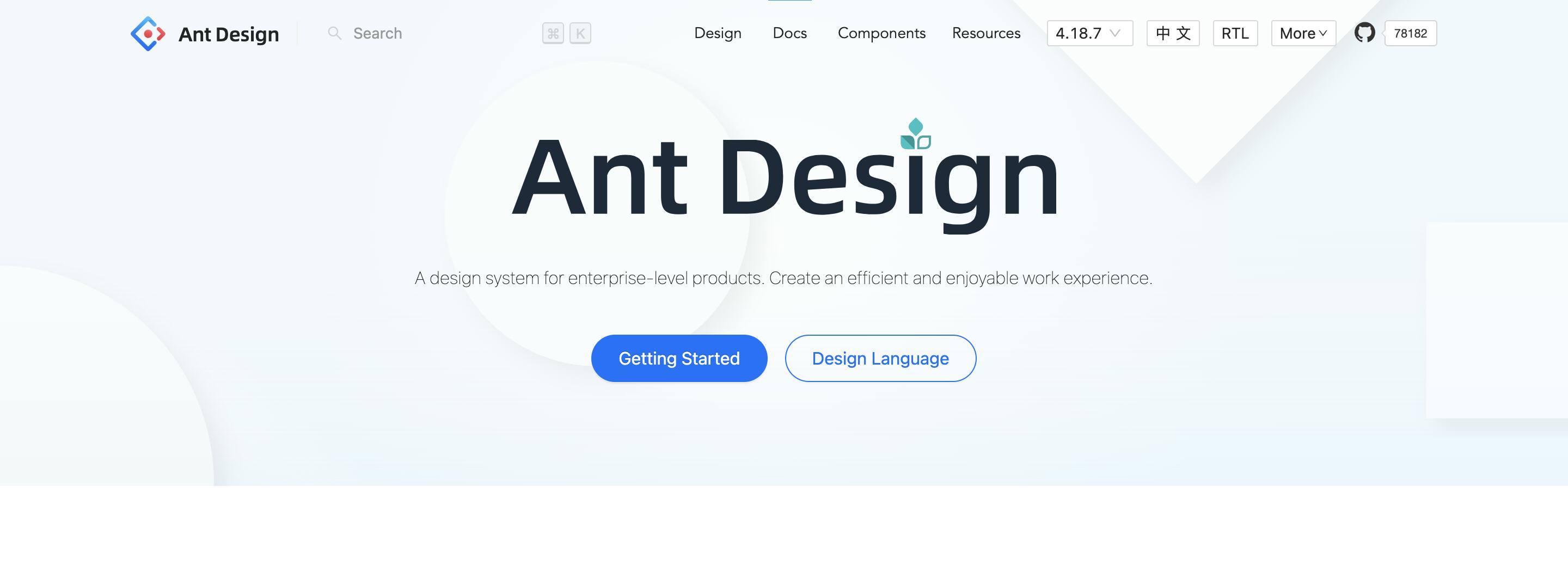
Ant Design is an enterprise-class UI design language and React UI library with a set of high-quality React components. Ant Design contains a set of high-quality components and demos for building rich, interactive user interfaces. It is also a very popular library and is used by companies such as Alibaba and Baidu.
It features Internationalization support for dozens of languages and powerful theme customization in every detail.
Installation:
//using npm
npm install antd

//using yarn
yarn add antd
Usage:
You have to import the stylesheet manually into your app.
import "antd/dist/antd.css";
You can now import the component you want into your app. In this example, we will use the Alert component. There are four types of Alerts in Ant design: success, warning, info, and error.
import "antd/dist/antd.css";
import { Alert } from "antd";

const AlertMessage = () => {
  return (
    <div>
      <Alert message="success message" type="success" />
      <Alert message="warning message" type="warning" />
      <Alert message="error message" type="error" />
      <Alert message="info message" type="info" />
    </div>
  );
};
Output:

3. Chakra UI
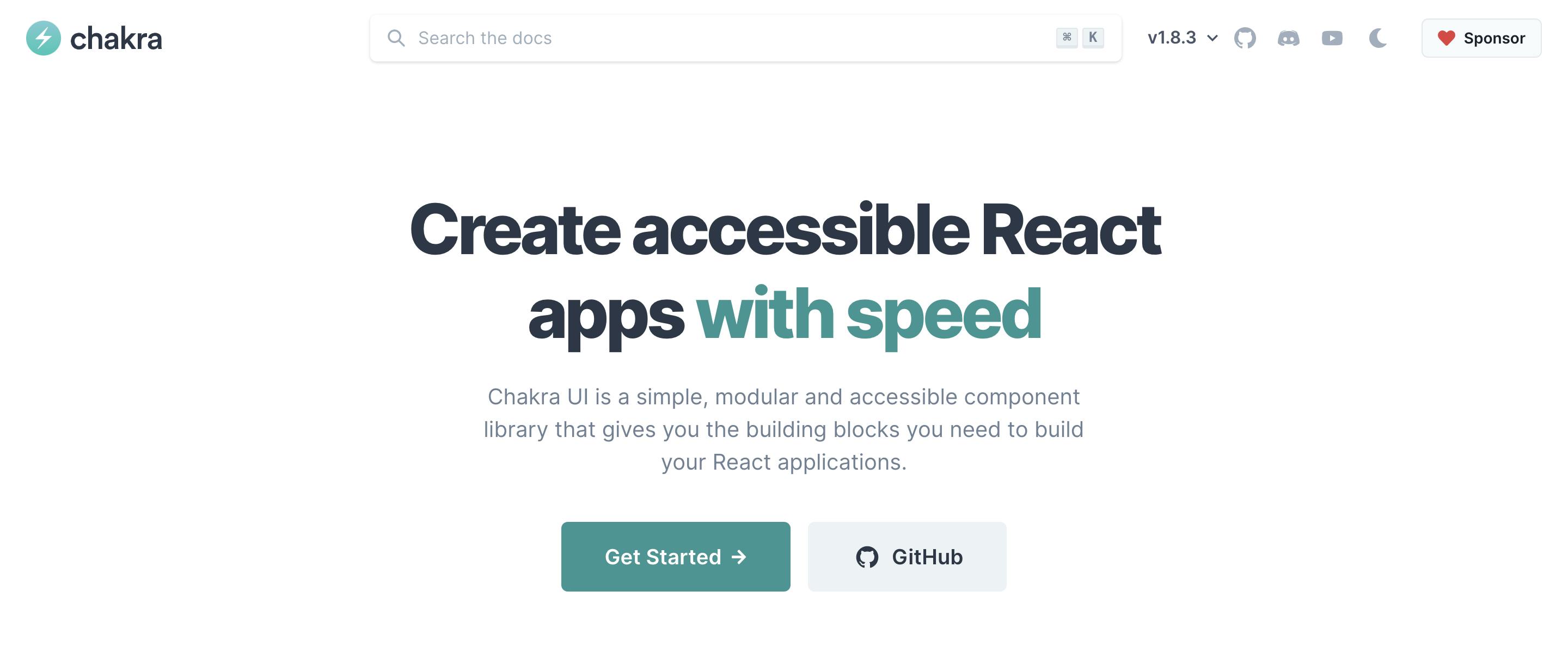
Chakra UI is a simple, modular and accessible component library that gives you the building blocks you need to build your React applications. It is customizable and reusable. Chakra UI also has very beginner-friendly documentation.
Installation:
Install Chakra UI in your project by using either of the commands below:
//using npm
npm i @chakra-ui/react @emotion/react@^11 @emotion/styled@^11 framer-motion@^6

//using yarn
yarn add @chakra-ui/react @emotion/react@^11 @emotion/styled@^11 framer-motion@^6
Usage:
To make Chakra UI components work properly in your app, you need to import a ChakraProvider component into the root of your app
import * as React from 'react'

// 1. import `ChakraProvider` component
import { ChakraProvider } from '@chakra-ui/react'

function App({ Component }) {
  // 2. Use at the root of your app
  return (
    <ChakraProvider>
      <Component />
    </ChakraProvider>
  )
}
To use any component from Chakra UI, you have to first import it from @chakra-ui/react and then you can render the component.
import { Image, Box } from "@chakra-ui/react";

const ImageExample = () => {
  return (
    <Box boxSize="lg">
      <Image src="https://source.unsplash.com/gySMaocSdqs/600x300" alt="random image" />
    </Box>
  );
};
You can find some examples of Chakra UI components here.
4. React Bootstrap
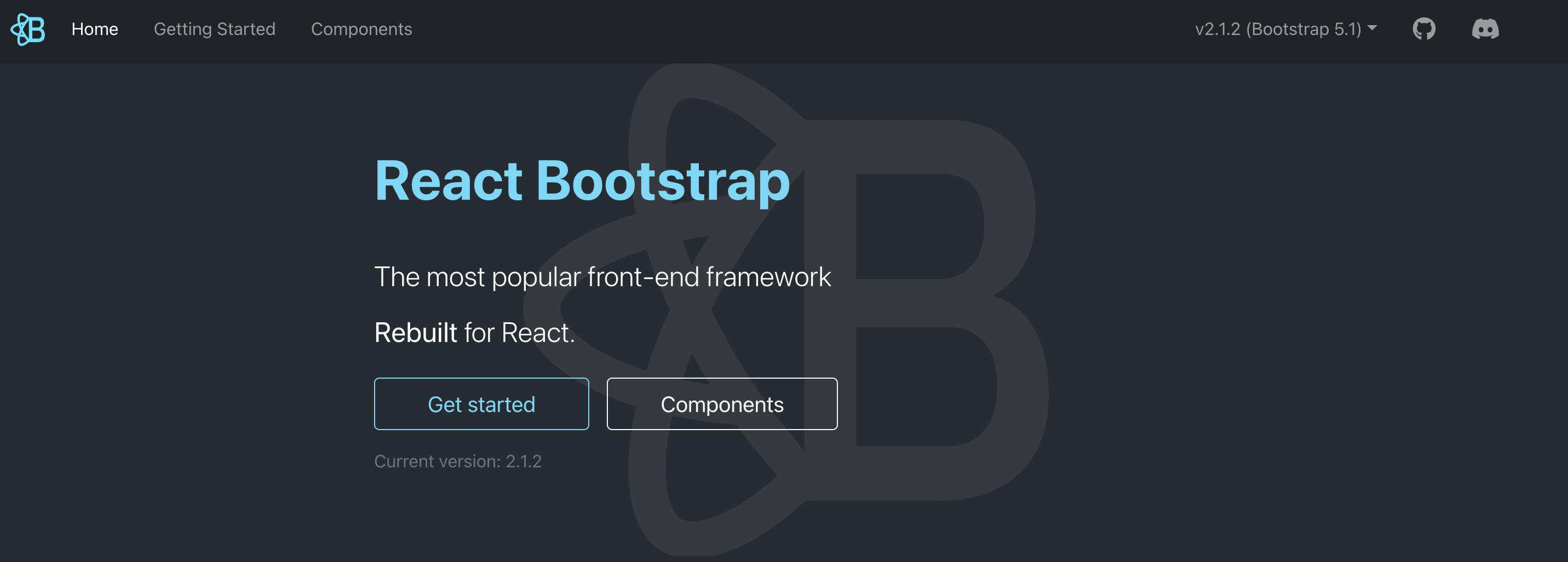
React-Bootstrap is one of the oldest react libraries and it has evolved and grown alongside React, making it an excellent choice as your UI foundation. It is a complete re-implementation of the Bootstrap components using React. It has no dependency on either bootstrap.js or jQuery.
The React-Bootstrap library is accessible by default giving more control over the form and function of each component.
Installation
//using npm
npm install react-bootstrap

//using yarn
yarn add react-bootstrap
Usage
import React, { useState } from 'react';

import Jumbotron from 'react-bootstrap/Jumbotron';
import Toast from 'react-bootstrap/Toast';
import Container from 'react-bootstrap/Container';
import Button from 'react-bootstrap/Button';

import './App.css';

const ExampleToast = ({ children }) => {
  const [show, toggleShow] = useState(true);

  return (
    <>
      {!show && <Button onClick={() => toggleShow(true)}>Show Toast</Button>}
      <Toast show={show} onClose={() => toggleShow(false)}>
        <Toast.Header>
          <strong className="mr-auto">React-Bootstrap</strong>
        </Toast.Header>
        <Toast.Body>{children}</Toast.Body>
      </Toast>
    </>
  );
};

const App = () => (
  <Container className="p-3">
    <Jumbotron>
      <h1 className="header">Welcome To React-Bootstrap</h1>
      <ExampleToast>
        We now have Toasts
        <span role="img" aria-label="tada">
          🎉
        </span>
      </ExampleToast>
    </Jumbotron>
  </Container>
);

export default App;
You can find some examples of react-bootstrap on code sandbox here
5. Grommet
Grommet is a React-based framework that provides accessibility, modularity, responsiveness, and themes in a tidy package. This UI library uses CSS Flexbox and Grid to provide flexible layouts for all screen sizes. It also provides powerful theming tools to tailor the component library to align with your Color, Type, Layout needs.
Installation:
To install Grommet, run the command below:
npm install grommet grommet-icons styled-components --save
You'll have to import the Grommet component to use it in your project
import React from 'react';
import { Grommet } from 'grommet';
Usage:
import React from 'react';

import { Button, Grommet } from 'grommet';


const ButtonExample = () => {
  return(
     <Grommet>
        <Button label='Submit' />
     </Grommet>
  )
};
export default ButtonExample;
To start building a new app with Grommet, you can check out this link for how to get started, or if you already have an existing app and you want to integrate Grommet into it, then you can use this link.
A lot of reputable organizations such as Netflix, Uber, Sony, etc use Grommet so you don't have to worry about support for your app.
6. PrimeReact
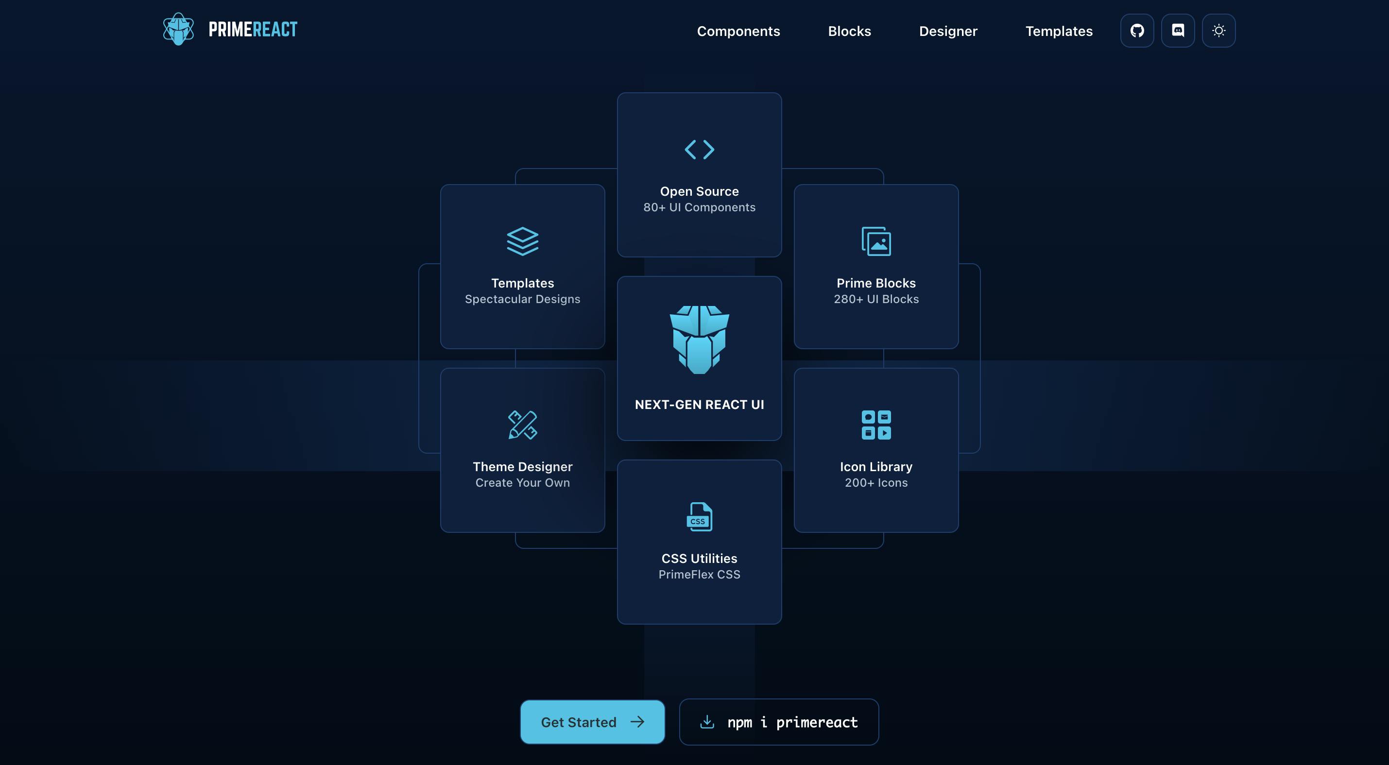
PrimeReact is a rich set of open-source native components for React. It has over 80 React UI Components with top-notch quality to help you implement all your UI requirements in style.
A look at the official website will convince you to use PrimeReact in your next project. It has full support for typescript and accessibility. It is also used by notable organizations such as Intel, Nvidia, and American Express. PrimeReact has premium templates and themes that you can use to kickstart your project.
Installation:
using npm:
npm install primereact
npm install primeicons
using yarn
yarn add primereact
yarn add primeicons
Usage: In this example, we will make use of the date picker component, and we will create a basic calendar with it.
import React, { useState } from "react";

import { Calendar } from "primereact/calendar";

export default function App() {
  const [date, setDate] = useState("");
  return (
    <div className="App">
      <Calendar id="basic" value={date} onChange={(e) => setDate(e.value)} />{" "}
    </div>
  );
}
7. Shards React
Shards React is an open-source, modern React UI kit that’s built from scratch and geared towards fast performance. It is created by Design revision and it is really easy to get started with. Although some parts of the documentation are still a work in progress, you'll still get a good grasp of it.
Installation:
Using npm:
npm i shards-react
Using yarn
yarn add shards-react
Usage: In this example, we created a Button component, and to do this, we need to first import the Button component from shards-react and then we can use the button in our function.
import React from "react";
import { Button } from "shards-react";

const ButtonSample = () => {
  return (
    <>
      <Button theme="info">Info</Button>
      <Button theme="warning">Warning</Button>
    </>
  );
};

export default ButtonSample;
8. React Suite
React Suite is a suite of React components, sensible UI design, and a friendly development experience. It is designed for the middle platform and back-end products. It helps to create interactive designs and also provides developers with a friendly development experience.
Installation:
Using npm:
npm i rsuite --save
Using yarn:
yarn add rsuite
Usage:
To use a component in rsuite, all you have to do is import that component. In this example, we're using a simple button component.
import React from "react";
import { Button } from "rsuite";

const ButtonSample = () => {
  return (
    <>
      <Button>Hello There!</Button>
    </>
  );
};

export default ButtonSample;
9. Tailwind CSS
Tailwind CSS is not a react UI library, but it is gaining a lot of popularity and I thought to add it to this article.
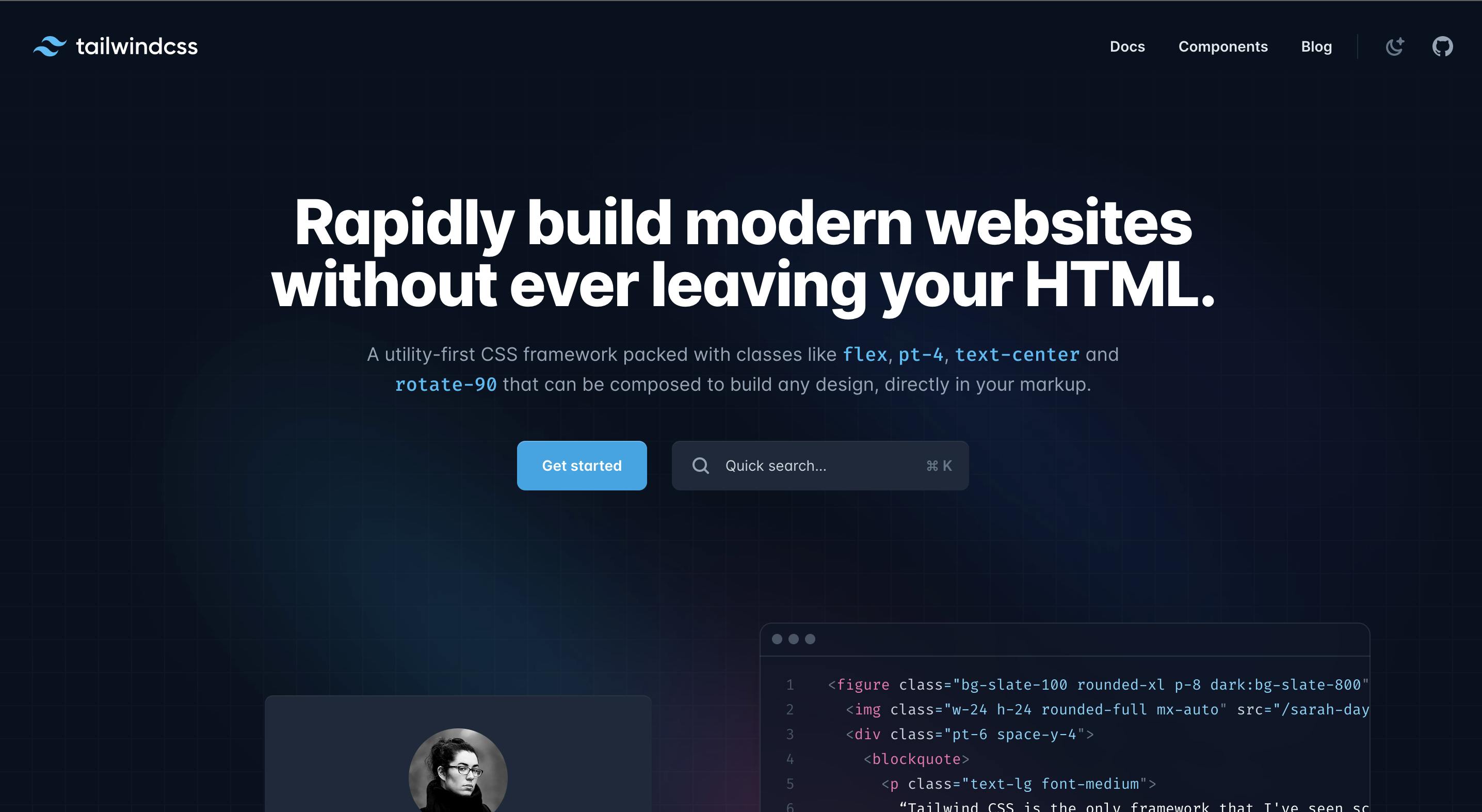
Tailwind CSS is a utility-first CSS framework that can be composed to build any design, directly in your markup. It allows you rapidly build modern websites without ever leaving your HTML / JSX code. It uses a default mobile-first approach and the availability of utility classes makes it easier to build complex responsive layouts freely.
It also has very great documentation and you can check it out for directions on how to install and configure tailwindcss into your project.
Usage:
This is an example of a button component with Tailwind CSS styling.
<button class="bg-purple-500 text-white py-2 px-6 font-semibold rounded border hover:bg-pink-600">Sign In</button>
Other Notable mentions of React UI libraries that are not commonly used includes:
Conclusion.
This article has introduced you to the basics of some of the React UI libraries that are commonly used and this should help you to know which of the libraries you should use for your next project.
To get a full understanding of any UI library that you have chosen to work with, you need to take a step further by actually going through the documentation for more in-depth examples.
